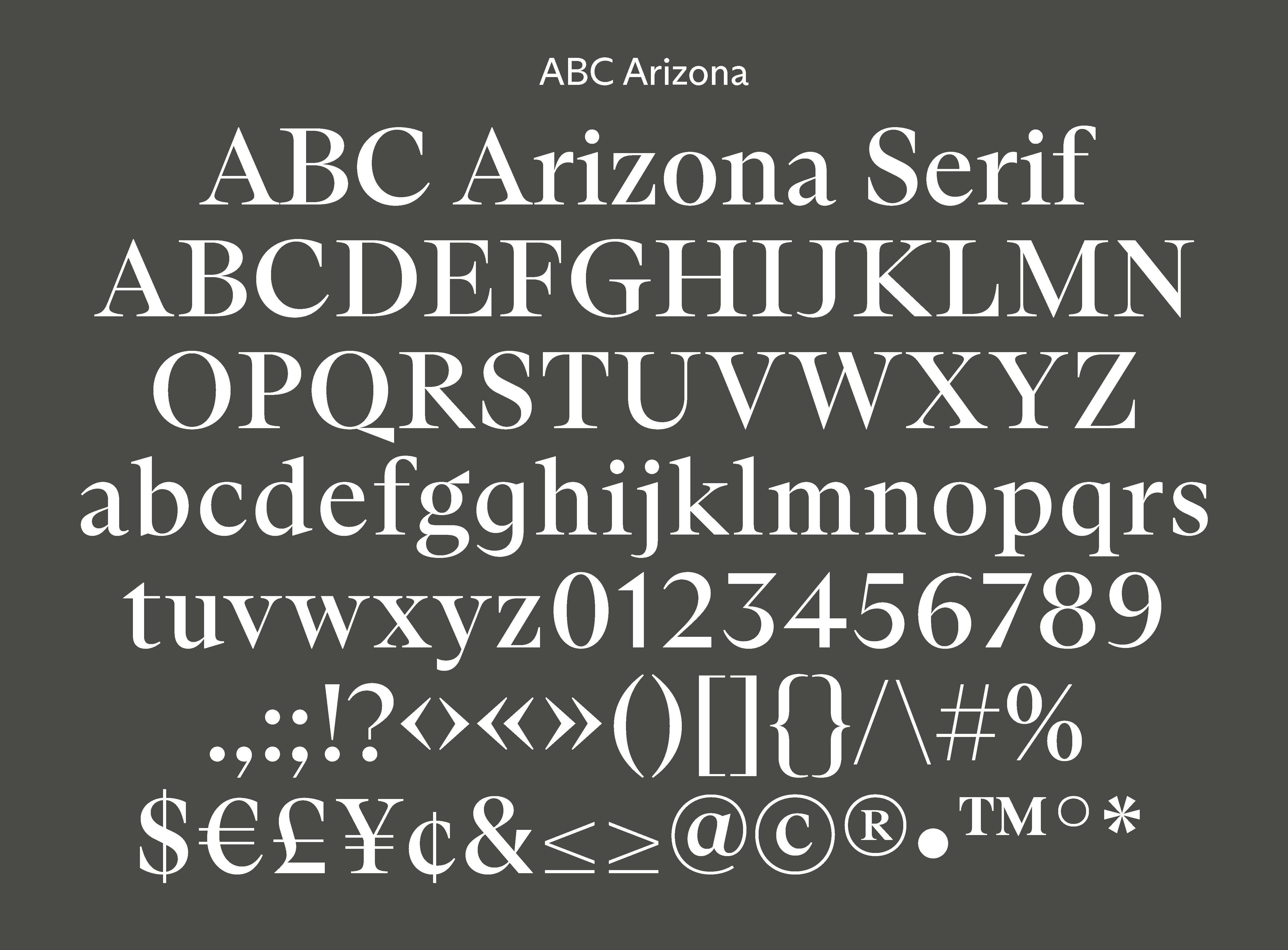
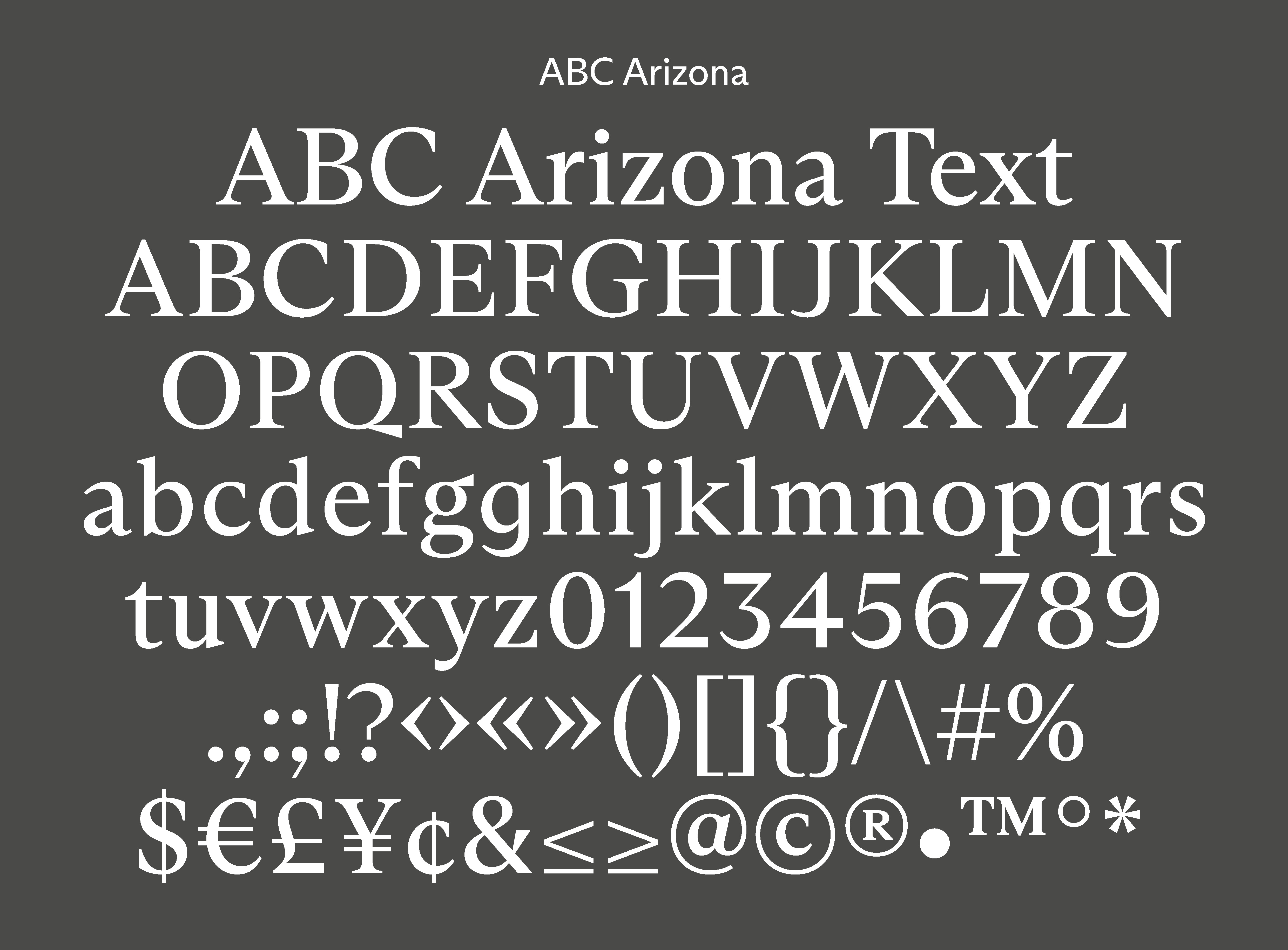


ABC Arizona
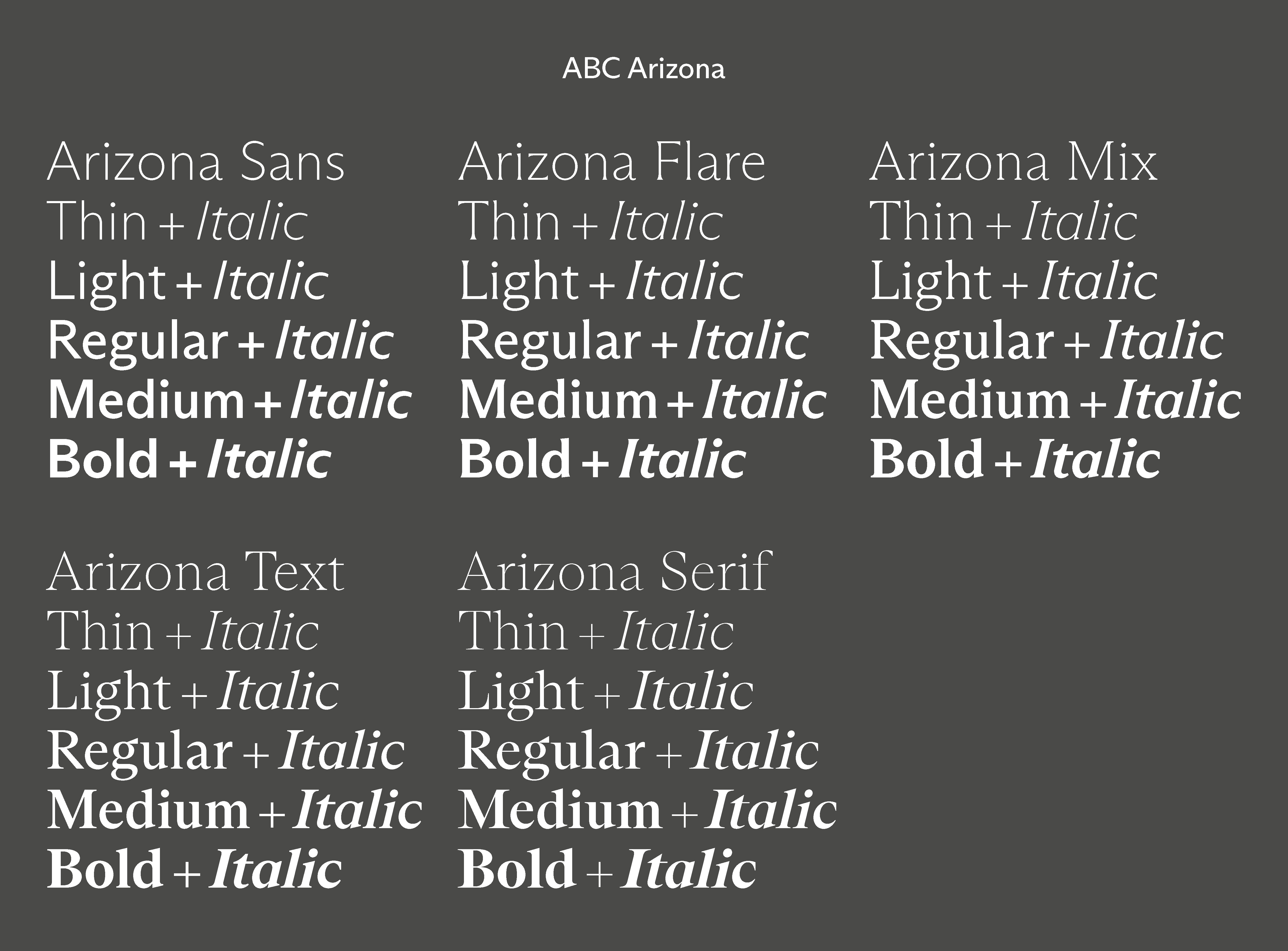
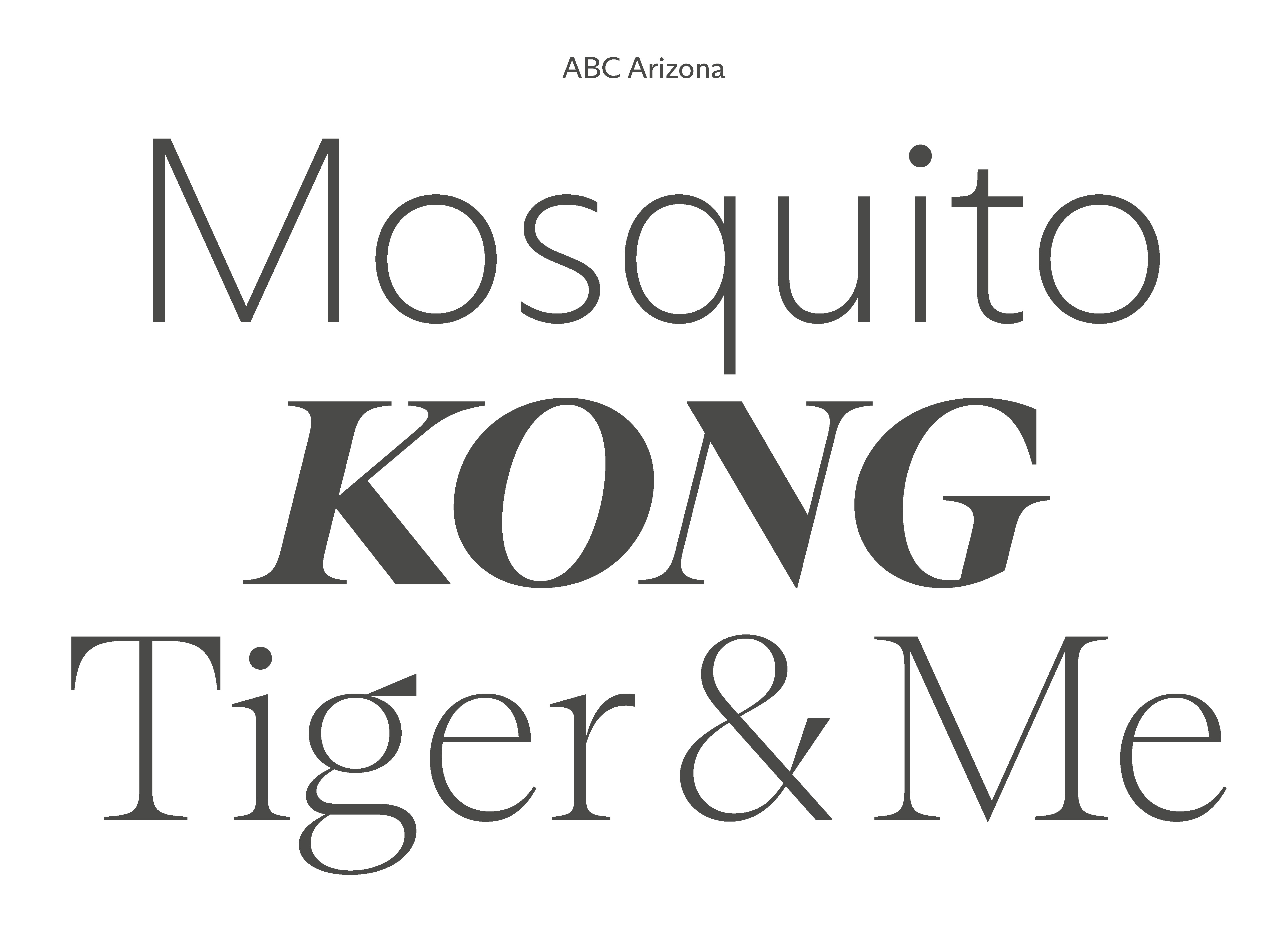
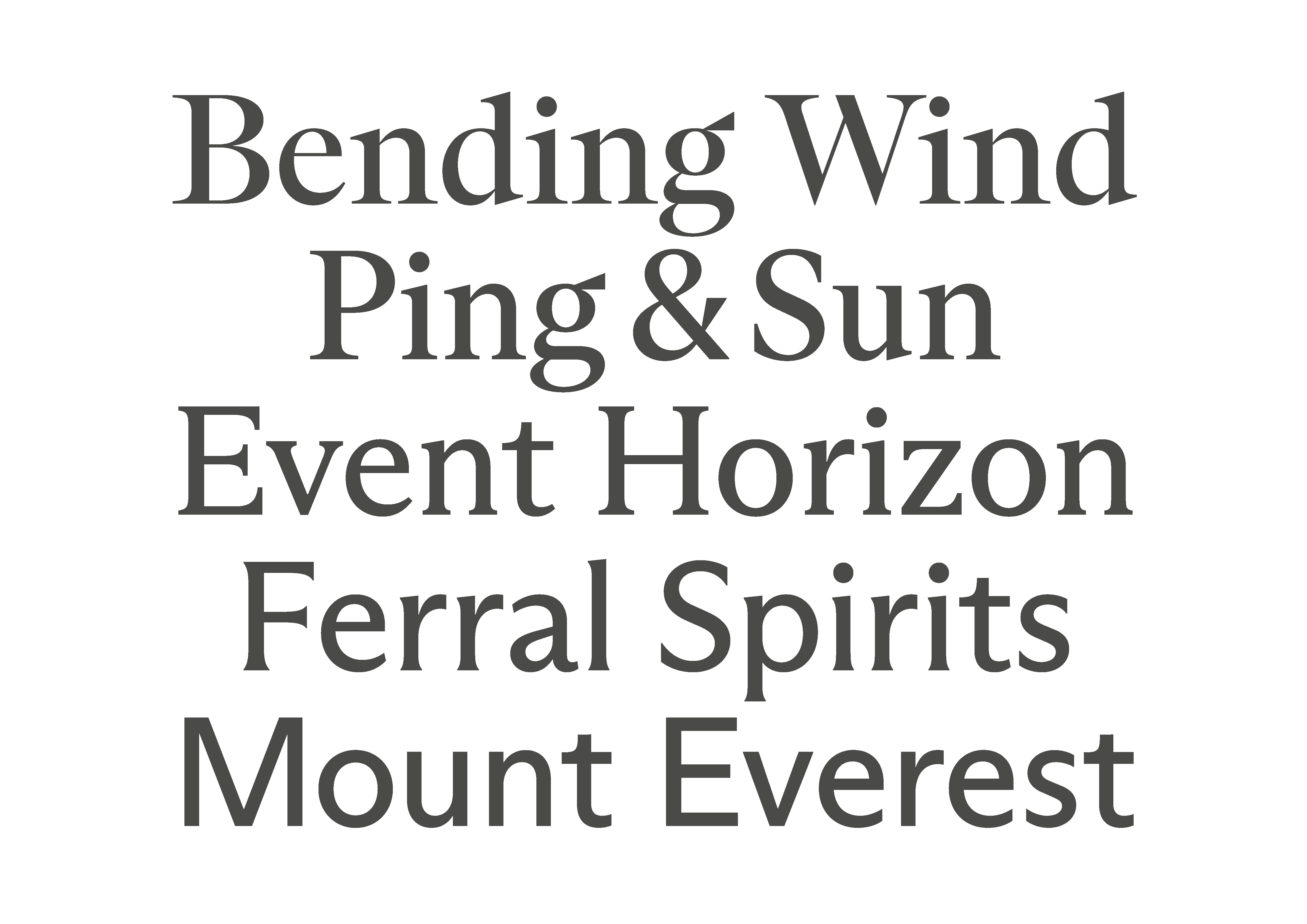
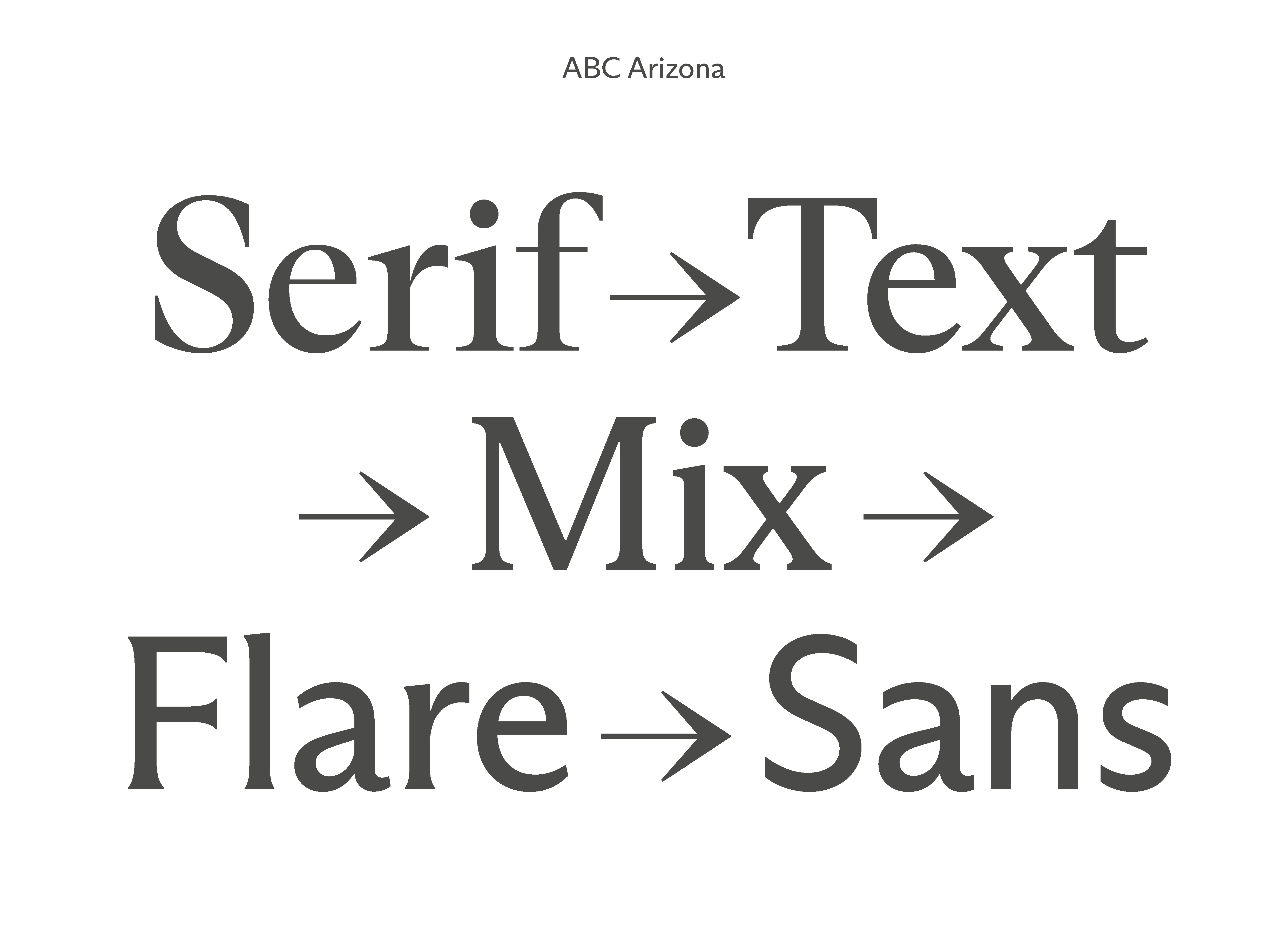
ABC Arizona is the first ever sans to serif “superfamily” that packages its five looks—Serif, Text, Mix, Flare, and Sans—into one single font file. In other words, it’s a slim, all-genres-in-one font happy-meal, versatile and adjustable for any context. ABC Arizona has five distinctive yet connected subfamilies: Serif, Text, Mix, Flare, and Sans. ABC Arizona Serif is a high contrast, pointy serif with a modern-meets-Renaissance freshness, and on the other side of the spectrum, ABC Arizona Sans is a straight-forward grotesque with a humanistic touch. In-between lie other species, such as the nearly-but-not sans ABC Arizona Flare. ABC Arizona Mix is chunkier and low-contrast, sitting exactly midway between the two extremes. Lastly ABC Arizona Text is a classic text serif typeface that’s well-suited for reading. Stretching from its headline to small text possibilities, an entire library can be typeset with just this one typeface. Each subfamily comes with Thin, Light, Regular, Medium, Bold, and Italics as static font files. Or the typeface can be used as a VF, which includes the entire family and all its styles, as well as all its nearby and distant relatives.
Published by Dinamo Typefaces.
Fully Explore the ABC Arizona here


HAL Colant
Colant is based on “Columbia Antiqua”, a Scotch/Modern-style serif typeface, featuring distinct angular details and produced by the Bauer’sche Giesserei (Frankfurt am Main) on the occasion of the 1893 World Exposition in Chicago. It comes in one weight with an additional italic, which was not included in the sampled sources.
Available on Request
Download HAL Trials & Licensing Options


HAL Matex Typeface
Matex is strongly inspired by schoolbook/textbook grotesques, partially incorporating a bauhaus aesthetic by referencing Herbert Bayer’s mid-1920’s, lowercase “Universal”. The typeface exists in two cuts, a regular version and a stemless variant, of which the stem endings of several lowercase characters are removed. This leads to several curved, arched letter shapes, resulting in a more naive overall appearance.
Available on Request
Download HAL Trials & Licensing Options
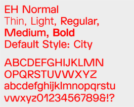
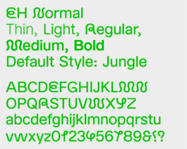
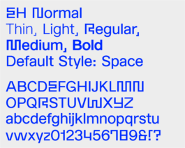
EH Normal Typeface
Normal is a grotesque typeface with sharp edges. It comes in five weights: Thin, Light, Regular, Medium and Bold including three stylistic Sets: City(Default), Jungle & Space.
Available on Request
Download Trial & Licensing Options


HAL Colant
Colant is based on “Columbia Antiqua”, a Scotch/Modern-style serif typeface, featuring distinct angular details and produced by the Bauer’sche Giesserei (Frankfurt am Main) on the occasion of the 1893 World Exposition in Chicago. It comes in one weight with an additional italic, which was not included in the sampled sources.
Available on Request
Download HAL Trials & Licensing Options
HAL Matex Typeface
Matex is strongly inspired by schoolbook/textbook grotesques, partially incorporating a bauhaus aesthetic by referencing Herbert Bayer’s mid-1920’s, lowercase “Universal”. The typeface exists in two cuts, a regular version and a stemless variant, of which the stem endings of several lowercase characters are removed. This leads to several curved, arched letter shapes, resulting in a more naive overall appearance.
Available on Request
Download HAL Trials & Licensing Options
EH Normal Typeface
Normal is a grotesque typeface with sharp edges. It comes in five weights: Thin, Light, Regular, Medium and Bold including three stylistic Sets: City(Default), Jungle & Space.
Available on Request
Download Trial & Licensing Options